How To Know If Someone Blocked You On iMessage? 5 Secret Hacks!
Apr 16, 2025

Apr 16, 2025

Apr 16, 2025

Apr 15, 2025

Apr 11, 2025

Apr 11, 2025

Apr 11, 2025

Apr 08, 2025

Mar 29, 2025
Sorry, but nothing matched your search "". Please try again with some different keywords.


Welcome to the colorful and creative world of WordPress design, where the aim is not just about making your website look good but ensuring it provides an outstanding user experience (UX). While it’s easy to assume that elevating your website’s design and UX requires a hefty investment, the truth speaks otherwise.
With a few inventive design hacks, you can significantly enhance the UX of your WordPress website without having to stretch your budget.
In this blog, we’ll dive into some cost-effective WordPress design strategies that will not only boost your website’s user experience but also elevate its presence in the digital realm.
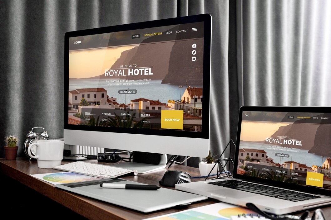
Whether you’re a burgeoning blogger, a small business owner, or simply looking to improve your existing website, these tips are designed for you. Let’s embark on this budget-friendly journey to make your website not just look amazing but feel amazing to every visitor!
User experience (UX) is like the heartbeat of your WordPress site. It’s all about how visitors interact with your site and how they feel about that interaction. Good UX means your website is intuitive, easy to navigate, and provides value, making visitors more likely to stick around, engage with your content, and even convert into loyal customers or followers.
In essence, enhancing user experience is not just about making your site look pretty; it’s about creating a seamless journey for your visitors from the moment they land on your page to the moment they leave.
The design of your WordPress site plays a crucial role in user engagement. It’s the first thing that captures attention and can make or break the user’s decision to stay or bounce. A well-designed site utilizes colors, fonts, and layout strategically to not only catch the eye but also facilitate easy navigation and highlight important information.
When your design resonates with your target audience, it can significantly increase the time they spend on your site, lower bounce rates, and ultimately improve conversions. Remember, every element on your site should serve a purpose towards engaging users and enhancing their overall experience.
One of the most budget-friendly yet impactful ways to boost UX is by optimizing your site’s speed. In a fast-paced digital world, visitors have little patience for slow-loading pages, with most expecting a site to load within two seconds.
Improving your website’s speed can be as simple as compressing images, minimizing the use of heavy plugins, and choosing a reliable hosting service. These simple tweaks can have a dramatic effect on your site’s performance, reducing bounce rates and keeping users engaged for longer periods.
With the explosion of mobile internet usage, having a responsive design is non-negotiable. This means your WordPress site must look good and function well across all devices, from desktops to smartphones. Adopting a responsive design not only enhances user experience but also contributes to higher search engine rankings.
Thankfully, there are plenty of free and premium WordPress themes specifically designed to be responsive, ensuring your site is accessible and appealing to all users, regardless of the device they use.
Never underestimate the power of white space, also known as negative space, in web design. It’s the empty space around and between elements on a page. Far from being wasted space, effective use of white space can significantly improve readability and focus on your WordPress site.
It creates a clean, uncluttered look, making it easier for visitors to navigate and digest content. Strategic use of white space can guide users’ attention to the most important information or calls to action on your site. Incorporating white space doesn’t cost a dime but can greatly enhance the overall aesthetics and user-friendliness of your website.
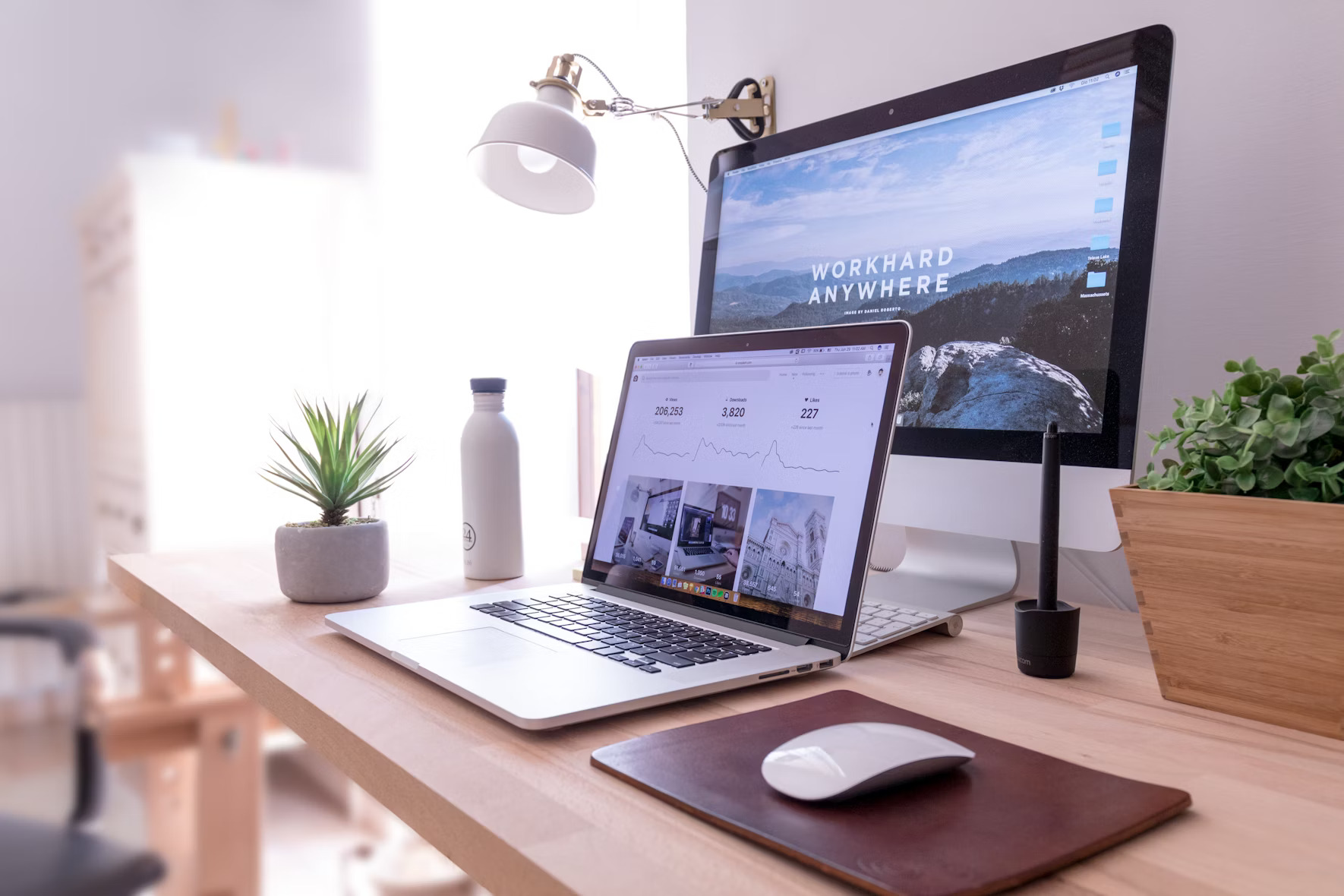
When embarking on the journey of designing or redesigning your WordPress site, it’s essential to acknowledge that visual appeal plays a critical role in the overall user experience.
Fortunately, elevating the aesthetic aspects of your site doesn’t have to deplete your budget. Here are a few budget-friendly strategies for enhancing the visual appeal of your WordPress site.
The phrase “a picture is worth a thousand words” holds incredibly true in the realm of web design. High-quality images and graphics can convey your message more effectively and make your site more engaging and professional-looking. Fortunately, there’s no need to break the bank on expensive photoshoots or graphic designers.
A multitude of free and affordable stock photo websites offer stunning visuals that can dramatically enhance your site’s look and feel. When choosing stock photos, aim for images that represent the diversity of your audience and resonate with the message and values of your brand. Remember, consistency in style and quality across all images and graphics on your site can significantly improve its cohesive aesthetic.
Color is a potent tool in design, capable of evoking specific emotions and reactions from your website visitors. Incorporating color psychology into your design choices allows you to subtly influence how users feel about your site and brand. For instance, blue can evoke feelings of trust and stability, while yellow can stimulate happiness and energy.
When choosing a color scheme for your WordPress site, consider the emotions you want to elicit from your audience and select colors accordingly.
Keep your color palette limited to a few complementary colors to ensure your site looks organized and professional. This strategic use of color can greatly enhance the user experience without the need for a hefty investment.
An essential aspect of improving user experience on your WordPress site involves making navigation as straightforward and intuitive as possible. Here are a few tips to guide your users seamlessly through your site.
Complex or overly elaborate menus can confuse visitors and discourage them from exploring your site further. To avoid this, streamline your menu structure. Limit the number of items in your main menu and organize content logically.
A simpler menu enhances usability and makes it easier for visitors to find what they’re looking for, thereby improving their overall experience on your site.
CTA or Call-to-action buttons play a significant role in guiding users toward necessary actions, like making buying decisions or signing up for a newsletter. To create effective CTAs, use concise, action-oriented language that clearly tells users what to expect when they click.
Moreover, make these buttons stand out by using contrasting colors from your site’s color scheme. A well-designed CTA button can significantly increase user engagement and conversion rates.
Forms are a common element on WordPress sites, used for everything from newsletter subscriptions to contact inquiries. Ensuring these forms are user-friendly can greatly enhance the user experience.
Keep forms as brief as possible, asking only for necessary information. Use clear, descriptive labels for each field and provide validation messages to help users correct errors. Streamlining the form submission process not only improves the overall user experience but also encourages more interactions, which is beneficial for your site’s goals.
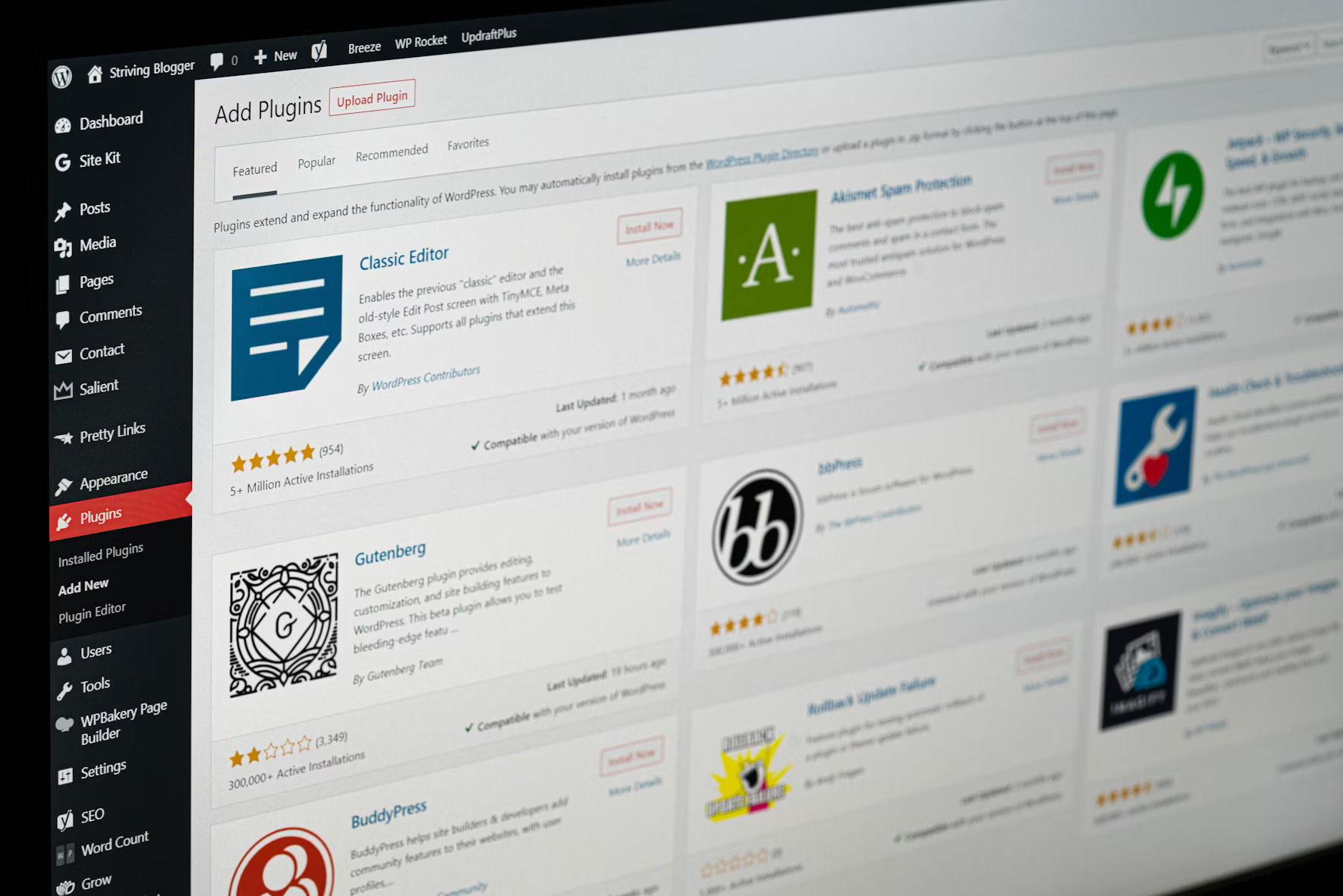
Creating a website that looks professional and is user-friendly doesn’t have to drain your wallet. WordPress offers a plethora of plugins and tools that can significantly enhance your site’s functionality and overall user experience. The best part? Many of these tools are entirely budget-friendly or even free.
Plugins can be game-changers when it comes to improving the user experience of your WordPress site.
Here are a few must-have plugins that are easy on the budget:
The visual aspect of your site plays a significant role in the user experience. Fortunately, there are several free tools available that can help you enhance the aesthetics of your website without needing a background in graphic design:
Designing a user-friendly website is an ongoing process. Once your site is up and running with its new design elements, it’s crucial to test and optimize these changes to ensure they’re truly benefiting your visitors.
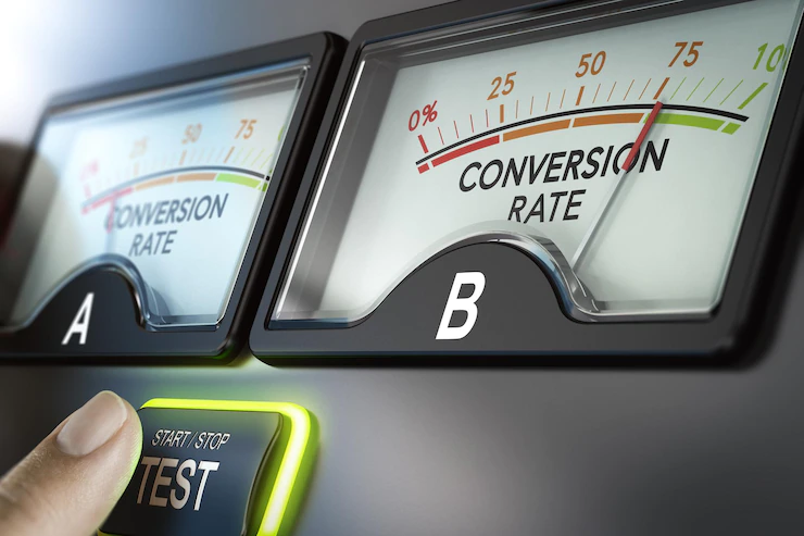
A/B testing, or split testing, is a method where you compare two versions of a webpage to see which one performs better. This can involve comparing different layouts, color schemes, or call-to-action buttons to determine what your audience prefers.
Tools like Google Optimize can help you set up A/B tests for free, allowing you to make data-driven decisions that enhance the user experience.
While A/B testing is valuable, direct feedback from your users is irreplaceable. Encourage visitors to share their thoughts through feedback forms or surveys.
Paying attention to comments or emails from your audience can give you specific insights into what changes would make your website more user-friendly.
Tools like Hotjar can provide visual feedback through heatmaps and session recordings, showing you exactly how users interact with your site and where they might be experiencing problems.
Improving your WordPress site’s user experience on a budget is entirely possible with the right approach and tools. By leveraging free and budget-friendly plugins, incorporating high-quality design resources, and continuously testing and optimizing based on user feedback, you can create a site that not only looks great but is also a pleasure for your audience to navigate.
Elevating your WordPress site’s user experience doesn’t have to drain your budget. With a handful of creative design hacks, you can significantly improve how visitors interact with your site.
Remember, focusing on simplicity, incorporating high-quality stock photos, and ensuring your site is mobile-friendly are key steps toward an engaging user experience.
These budget-friendly strategies prove that you can enhance your website’s design and functionality without breaking the bank. So, dive in, apply these tips, and watch as your site transforms into a more attractive, user-friendly platform.
Happy designing! 😊
Read Also:
Nabamita Sinha loves to write about lifestyle and pop-culture. In her free time, she loves to watch movies and TV series and experiment with food. Her favorite niche topics are fashion, lifestyle, travel, and gossip content. Her style of writing is creative and quirky.
View all Posts
How To Know If Someone Blocked You On iMessag...
Apr 16, 2025
7 Website Design Mistakes That Are Hurting Yo...
Apr 16, 2025
Programmable Dynamic SEO for Location-Based P...
Apr 15, 2025
Google Boba Game: How To Play This Fun Game B...
Apr 11, 2025
Which Is The Best Video Search Engine Of 2025...
Apr 11, 2025