How To Know If Someone Blocked You On iMessage? 5 Secret Hacks!
Apr 16, 2025

Apr 16, 2025

Apr 16, 2025

Apr 15, 2025

Apr 11, 2025

Apr 11, 2025

Apr 11, 2025

Apr 08, 2025

Mar 29, 2025
Sorry, but nothing matched your search "". Please try again with some different keywords.


Businesses have been using webinars to connect more with their customer base. Using webinars has proven to be more effective than posting a blog or a video. It makes people feel more engaged with the business representatives, and a webinar landing page is the first step you must take.
So, what is this page exactly? How have big companies created landing pages to attract the most leads attending their webinars? It’s not magic – just smart decisions that always work.
Therefore, if you have the task of creating a webinar landing page, you are in the right place.
After seeing so many great landing pages, I have found a few common elements in them. Elements that made them work and convert the most leads. Elements that YOU must have in your webinar landing page as well.
Therefore, keep on reading this post to learn from practical examples!

If you don’t know what a webinar landing page is, then don’t worry. It’s simply a page on your website that directs visitors to attend your webinar.
Whether it’s for collecting new members for your real estate social network or for teaching the benefits of SEO programming to SEO freelancers and SEO consultants – webinars have become common in the virtual world.
There are three main tasks this landing page must do. They are:
Therefore, your webinar landing page must have some elements to attract people. These elements are:
Therefore, let’s learn how to create these elements to generate the most inbound leads!
I found commonalities after checking out and analyzing every element of the webinar landing page created by the biggest brands. After analyzing a bit more, I realized that these common elements do create a difference in differentiation between a good webinar landing page and a bad one.
Therefore, let’s….

The most crucial aspect of your webinar landing page is the information presented there. Your landing page should be informative, presenting all the facts accurately.
Regarding what information to present, think about your webinar from a viewer’s perspective. You must include two essential things that should be remembered by most. Have a look at the webinar landing page of CMI above, and you will realize they are:

Businesses create webinars to inform the target audience about new products and services to be launched. They are also conducted to notify them about recent and upcoming organizational developments and changes.
But how do you convince them to join your webinar?
It’s simple – learn and tap into their pain points.
Your target audience and customer base have certain requirements that help alleviate their pain points. Therefore, if you understand their reason for buying your products – highlight it.
Your webinar landing page should have facts about the needs of your customer base. This makes people believe that you understand them, alleviating the importance of your webinar in their minds. Additionally, use numbers to present stats. Numbers always work!
For example, look at the webinar landing page of Search Engine Journals above. They know that most businesses need help with PPC keyword research for advertising. It’s that easy to make the viewers conscious of their needs!

Continuing from above, you must present helpful information on your webinar landing page. After outlining what your webinar is about, explain how they will benefit by attending your webinar.
I will stress this point a lot. You may start your landing page with a question based on their pain points. For example, this webinar landing page of Groove begins with the question – “Are you maximizing your opportunity to sell?”
A question like this makes them think about it. Then, when they read what they will learn from your webinar, they will better understand its importance. This is the point where FOMO (Fear Of Missing Out) finally hits them!

Recent social media trends have clarified that videos engage our attention more than words. They are visually delightful to watch and are easier than reading 1000 words. Why not include them in your webinar landing page?
A video grabs your viewer’s attention immediately after they hit the play button. Plus, it has been proven to have a higher retention rate.
Have a look at the image above. Network Marketing Pro used a video to explain it all.
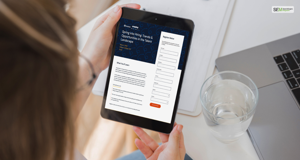
At the end of it all, you must measure the effectiveness of your webinar landing page. Therefore, to learn how many leads you generated for attending your webinar – you must ask them to fill out a form.
This form should not have too many fields to make it a chore for leads. Ensure that the form asks for necessary information that viewers are willing to share and also helps your webinar as well. Plus, include a CTA (Call to Action) button to make them complete the form!
It’s crucial to create a convincing webinar landing page for your webinar. The more compelling it is, the more leads and attendees you can generate. Therefore, after learning the points above, start designing your landing page!
If you see an exciting webinar landing page that convinced you to sign up, tell us what convinced you!
Also Read
Mashum Mollah is the feature writer of SEM and an SEO Analyst at iDream Agency. Over the last 3 years, He has successfully developed and implemented online marketing, SEO, and conversion campaigns for 50+ businesses of all sizes. He is the co-founder of SMM.
View all Posts
How To Know If Someone Blocked You On iMessag...
Apr 16, 2025
7 Website Design Mistakes That Are Hurting Yo...
Apr 16, 2025
Programmable Dynamic SEO for Location-Based P...
Apr 15, 2025
Google Boba Game: How To Play This Fun Game B...
Apr 11, 2025
Which Is The Best Video Search Engine Of 2025...
Apr 11, 2025

